BookEunoia
Book Cover Design Services
The Cover That
Stops the Scroll,
at Every Size.
Every reader judges your book by its cover. Not because they're shallow, but because they're efficient. In the 1.3 seconds a reader spends scanning an Amazon search result, your cover is communicating genre, quality, and story before a single word is read. We design covers that pass that test, at full size on a bookshelf and at 160 pixels on a screen.
1.3s
ScanningTime
160px
ThumbnailWidth
3
InitialConcepts
100%
CopyrightYours
No royalty splits, ever
No hidden fees
Global Distribution
Free consultation, no commitment
Your cover must work at every size
Print full size
Website display
Amazon listing
Search result
Genre signal must be readable at 160px. Type must be legible at 40px. Design that works at full size but collapses at thumbnail loses most of its sales.
Full print wrap: what we design
Back Cover
Spine
Front Cover
🎨 Genre-Matched Designers📱 Thumbnail-Tested at 160px📦 Full Print Wrap: Front, Spine & Back© 100% Copyright Yours🔄 3 Initial Concepts Included
🎨 Genre-Matched Designers📱 Thumbnail-Tested at 160px📦 Full Print Wrap: Front, Spine & Back© 100% Copyright Yours🔄 3 Initial Concepts Included
The test most covers fail
Your Cover Will Be Seen at
160 Pixels Wide. Is It Ready?
The thumbnail problem, at full size vs. the Amazon search result
Detailed cover
Full size, beautiful
→
Same cover
At 160px (Amazon)
✗ Visual noise
Designed for both
Full size, clean
→
Same cover
At 160px (Amazon)
✓ Reads clearly
Every cover we design is tested at thumbnail size during the concept stage, before you see it, not after you've approved it.
Why most self-published covers fail the only test that matters
Beautiful cover design and effective cover design are not always the same thing. A cover that looks stunning as a large image on a designer's screen can become completely unreadable at the sizes most readers encounter it: a 160-pixel-wide thumbnail in an Amazon search result or a 40-pixel icon in a "Customers also bought" row.
The covers that sell are the ones designed from the start with the thumbnail in mind. That means bold, high-contrast imagery with clear focal points, large legible typography that works at small sizes, and genre signals strong enough to read in a glance.
- Title must be legible at 40px, tested in our design process before client review.
- Genre signal must be immediate at the thumbnail, color, composition, and typography all contribute.
- Single strong focal point rather than multiple competing elements
- High contrast between text and background, low contrast disappears at small sizes
- No more than two typefaces, more creates visual noise that collapses at scale
- Author name readable but visually subordinate to title, hierarchy preserved at all sizes
Why genre visual language matters
Every Genre Has a Visual Code.
Readers Know It Instantly.
A thriller reader scanning Amazon knows a thriller cover before they've read the title. That recognition is built from decades of genre publishing conventions, and violating it is the fastest way to lose a reader who would have bought your book. Here is exactly what those conventions are.
Thriller & Crime
High-contrast dark palette, deep blues, blacks, slate
Sans-serif or condensed bold type, urgency and threat
Silhouette figures, shadowy environments, dramatic light
Title in large, dominant type, often top-weighted
Negative space used intentionally, creates dread
⚠ Wrong signals: warm palette, decorative script fonts, soft imagery. Readers will not recognize it as a thriller and will skip it.
Romance
Human figure(s) are dominant; the relationship is the visual story
Warm palette or high-saturation color, emotional warmth
Script or elegant serif typography, softness and intimacy
Subgenre-specific signals: historical period, contemporary setting, fantasy
Strong typography hierarchy: title large, author prominent
⚠ Wrong signals: abstract covers without human figures, cold palettes, sans-serif utilitarian type. Romance readers rely heavily on cover conventions.
Fantasy & Sci-Fi
World-building imagery, landscapes, creatures, and artifacts
Epic scale and dramatic lighting, sweeping, cinematic
Rich, deep palette, jewel tones, high saturation
Fantasy serif or custom display typefaces
Clear genre sub-type signal: epic vs urban vs cosmic horror
⚠ Wrong signals: photographic realism without fantastical elements, minimal design, contemporary styling. Fails to signal the genre world to readers.
Business & Leadership
Bold, high-contrast color blocking, authority, and clarity
Strong sans-serif or geometric serif typography, confidence
Minimal imagery, concept-driven, iconographic, or abstract
Author name as prominent as or larger than title, credibility
Professional restraint, not playful or decorative
⚠ Wrong signals: ornate decoration, stock photography clichés (handshakes, city skylines), busy layouts. Undermines the authority the genre requires.
Literary Fiction
Conceptual or abstract imagery, suggests a theme, not a plot
More restrained palette, often desaturated, aged, or muted
Premium serif or editorial typography, signals craft
Intentional whitespace, signals a different reading experience
Awards, endorsements, and author credibility are often prominent
⚠ Wrong signals: genre-fiction conventions (dark thriller tones, romance figure placement). Literary fiction readers actively avoid books that look genre-commercial.
Self-Help & Memoir
Aspirational, uplifting palette, optimistic, warm, or bright tones
Human connection or transformation imagery, before/after journey
Clean, accessible typography, approachable, and direct. Subtitled prominently, the promise of the book must be visible
Memoir: author photo often present, personal credibility
⚠ Wrong signals: dark or threatening imagery, overly abstract concepts, cold or clinical typography. Readers need to feel warmth and the promise of change.
Three approaches to cover design
Stock Photography, Custom Art,
or Typography-Led?
Authors often assume "cover design" is one product. It isn't. There are three fundamentally different approaches, with different aesthetics, costs, and genre appropriateness. Understanding which approach fits your book is the first decision.
Stock Photography
The most widely used approach
A professionally licensed stock image, carefully selected for genre fit, tone, and composition, combined with typography and design elements to create the final cover. When done well, stock photography covers are indistinguishable from covers using original art. The key is image selection: the right image for the genre, the right crop, the right color treatment. The wrong stock image produces immediately recognizable "self-published" results.
Best for: Thriller · Romance · Business · Self-Help · Memoir
Mid investment · Fast turnaroundCustom Illustration
Original artwork for your book
An original illustration commissioned specifically for your cover, creating a visual identity that no other book in the world shares. Essential for fantasy and children's books where the cover art must depict a specific world, character, or creature that doesn't exist in stock libraries. Requires coordination with an illustrator (handled by us), a longer timeline, and a higher investment, but produces a cover that is categorically unique.
Best for: Fantasy · Children's · Illustrated fiction · Prestige literary
Higher investment · Unique resultTypography-Led Design
When the words are the image
Some of the most effective and recognizable covers in the market carry almost no imagery; they rely entirely on typographic composition, color, and graphic design to create impact. Particularly effective for literary fiction, business books, and any title where the author's name carries its own authority. Requires exceptional typographic skill; amateur typographic covers are the most obviously self-published of all cover types when not executed precisely.
Best for: Literary fiction · Business · Essays · Poetry
Flexible investment · Distinctive resultFront, spine, and back
The Complete Print Wrap:
Three Surfaces, One Book.
Complete print wrap layout, every surface designed
Back Cover
Hook line, single compelling sentence
Book description / back blurb (150–200 words)
Author bio + optional author photo
Endorsements / reviews (if available)
ISBN barcode, bottom right, white box, correct placement
Spine
Front Cover
Primary image / key visual element
Title typography, dominant, genre-matched
Subtitle (if applicable)
Author name, correctly sized to genre convention
Spine must be legible at 20mm wide, title and author name only, vertical, correctly typeset
ISBN barcode placement is specification-critical; wrong placement fails print platform submission
The back cover blurb is a sales tool, not a summary, written to drive decision-making rather than to describe the content.
Why the back cover and spine matter as much as the front
In an online marketplace, the front cover does most of the work. But for physical bookshop presence, library display, and the specific moment when a reader picks up a book they found spine-out on a shelf, the back and spine are the deciding surfaces.
The spine must carry the title and author name legibly, at a minimum 20mm wide. For a standard paperback, this is a severe typographic constraint that most amateur designs get wrong. Text is either too small to read or set vertically in a way that creates awkward line breaks at narrow spine widths.
The back cover has a specific sales hierarchy that effective book design has converged on over decades: hook line, blurb, bio, endorsements, barcode. Deviating from this hierarchy confuses the reader and reduces conversion. We apply it precisely every time.
- The front cover was designed first, and the back and spine matched it as a cohesive unit.
- Spine set at your exact page count and paper stock width calculation
- Back cover blurb written or reviewed by our editorial team, not copied from your synopsis
- ISBN barcode generated and placed according to KDP/IngramSpark specification
- Full wrap delivered as a single press-ready PDF and as component files
- Separate eBook cover file (front cover only, 1600×2560px minimum)
The spine width calculation
Spine width is determined by page count × paper stock thickness. KDP and IngramSpark each have specific formulas. Getting this wrong means your cover file is rejected at upload. We calculate your exact spine width before the wrap is designed, not as an afterthought.
Planning ahead
Series Architecture:
One Visual System, Many Books.
A series cover system, consistent identity, distinct books
Book I
Book II
Book III
Book IV
Shared elements: gold band, typography system, layout grid. Distinguishing elements: dominant palette, central imagery, volume number treatment.
If you're planning more than one book, design the series system first
A series whose first book was designed without a system in mind creates a problem that the second book can never fully solve. Either the second book looks inconsistent with the first, or it looks so similar that the reader can't tell them apart on a shelf.
We build series cover systems from Book 1, establishing the visual elements that will recur across the series (typography, layout grid, graphic device, color logic) and the elements that will vary to distinguish each volume. This makes every subsequent cover faster, less expensive, and visually coherent.
Series color system
A dominant palette that shifts per book while maintaining a shared tonal identity, readers immediately recognize the series.
Typography lockup
The series title, volume number, and author name are consistently treated across all books, forming the visual grammar that holds the series together.
Layout grid and graphic device
A recurring compositional element, a band, frame, or graphic motif, that anchors the series identity across varying imagery.
The design journey
From Brief to Publication-Ready
In Five Clear Stages
A transparent, collaborative process, you see three initial concepts before committing to a direction, and nothing is finalized without your approval at each stage.
1
Creative Brief
Genre, audience, comp titles, tone, and your references. The brief that saves every re-work round.
Day 1–2
2
3 Concepts
Three distinct cover directions, different approaches, different treatments. You choose, and we develop.
Days 4–7
3
Refinement
The chosen concept was developed through rounds of revision, typography, color, and composition, all refined to your approval.
Days 8–12
4
Full Wrap
Back cover and spine designed and integrated. Blurb reviewed. Barcode placed. Print spec checked.
Days 13–16
5
File Delivery
Complete file package, print PDF, eBook cover, marketing assets, and source files delivered.
Day 17–21
What you receive on final delivery
Print-Ready Full Wrap PDF
KDP and IngramSpark are compatible. Correct spine width, 300 DPI, CMYK, 3mm bleed. Ready for immediate upload.
eBook Cover File
Front cover only, at 1600×2560px minimum, optimized for Kindle, Apple Books, and all digital platforms.
Marketing Image Set
Social media sizes (Instagram square, Facebook, Twitter), book mockup images, and thumbnail-optimized versions.
Source Files
Editable Photoshop or InDesign source file delivered to you, for future edition updates, paperback-to-hardcover adaptation, or series continuation.
Audiobook Cover File
Square-format (3000×3000px) audiobook cover for ACX, Findaway, and all audio platforms, included at no extra cost.
Full Copyright Transfer
Complete ownership of the final design, including commercial image licenses where applicable. You own it fully and permanently.
Author results
When the Cover Changed
Everything
Three authors discuss what happened when they replaced a self-designed or template cover with a professionally designed one.
★★★★★
"I'd been running Amazon Ads for six months, and my click-through rate was dismal. My ad manager told me bluntly that the cover was the problem, not the ads. I commissioned a redesign through BookEunoia, and within three weeks, my CTR doubled, and my conversion rate increased by 34%. Same book. Same keywords. Different cover."
★★★★★
"I kept getting feedback that my business book 'didn't look credible' despite the content being well-reviewed. The existing cover used a stock handshake image and a generic sans-serif font, classic mistakes that signal amateurism to business book readers. The redesign used bold color blocking and authoritative typography. The first month after the redesign was my best sales month in two years."
★★★★★
"The series system approach was exactly what I needed. I was about to publish Book 2 and had no coherent vision for how it should look alongside Book 1. They built us a complete visual architecture from scratch, including a typography lockup, color logic, and the graphic band that runs across all titles. Book 3 now takes a fraction of the time to design and looks like it belongs on the shelf with the first two."
Your questions
Cover Design Questions.
Direct Answers.
Do I own the copyright to my cover design?
Yes, fully and permanently. Copyright in the final cover design transfers to you upon project completion. Stock images used are licensed specifically for your cover under commercial licenses. Custom illustrations commission copyright as part of the project agreement. Source files are also delivered, so you're never dependent on us for future updates.
How much does professional book cover design cost?
Cover design is priced by scope and cover type. As a guide: eBook-only front cover from $350–$700; full print wrap (front, spine, back) from $600–$1,400; custom illustrated cover from $1,200–$3,500+. Series packages with a system design are priced per book, with a reduced rate from Book 2 onwards. We provide an itemized quote after the free consultation.
What if I don't like any of the three initial concepts?
The creative brief process is designed to ensure concepts are directionally aligned with your vision before the designer spends time on them. If all three concepts miss the mark despite a thorough brief, we investigate where the disconnect occurred and produce a new round. We do not consider the project complete until you have a concept you're excited about.
Can you redesign an existing cover I'm unhappy with?
Yes, and cover redesigns are one of the highest-ROI investments a self-published author can make. A professionally designed replacement cover typically significantly improves Amazon CTR within the first 4–6 weeks after the change goes live. We assess your current cover honestly and tell you whether a redesign is likely to make a meaningful difference.
Will you write my back cover blurb?
Yes, back cover blurb writing is included in full wrap projects. A blurb is a sales tool, not a summary, and writing one effectively requires different skills than writing the book itself. We review your existing blurb or write one from scratch based on your manuscript, applying proven commercial copywriting structure to drive the decision to buy.
How long does cover design take?
From brief completion to final file delivery: typically 14–21 business days for a complete print wrap. eBook-only covers can be turned around in 7–10 days. Custom-illustrated covers require additional time to coordinate with the illustrator (typically 4–8 weeks total). Rush turnarounds are available for 50% above the standard rate, discussed during consultation.

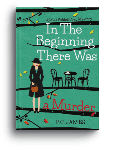


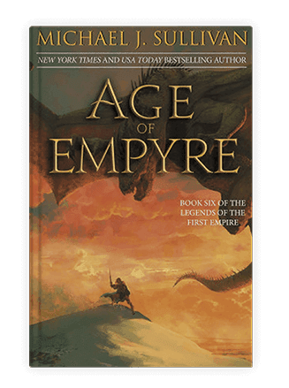
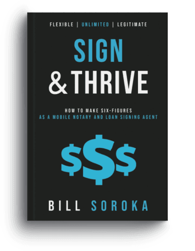
Our Work
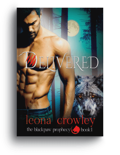
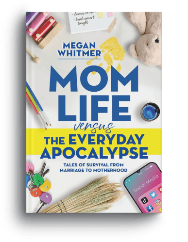
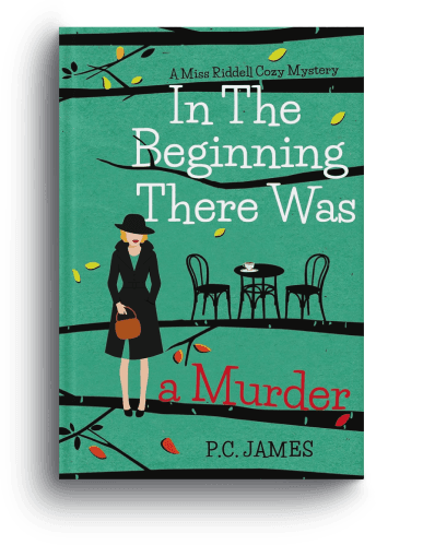
Behold Our Portfolio of Masterpieces
Every book we publish represents our uncompromising commitment to quality. Here are some of our best-selling titles.

















Your Book Deserves a Cover
That Makes Readers Stop.
Start with a free cover consultation, we'll review your genre, your comparable titles, and your brief, then tell you honestly what approach will produce the most effective cover for your book.
3 initial concepts included · Full wrap: front, spine, and back · 100% copyright yours
Start your cover project
Tell Us About
Your Book
Share your book's genre, your vision, and any covers you admire, and we'll come back within one business day with an initial assessment, comparable cover examples, and a transparent quote.
Call us
+1 (929) 684 2021
Email us
hello@bookeunoia.com
Response time
Within 1 business day