BookEunoia
Book Illustration Services
Your Story Told in
Words and Art,
Beautifully, Both.
The right illustration doesn't decorate a book. It does things words cannot. It shows a child the exact expression on the monster's face. It places an adult reader inside a world before they've read a sentence. It makes a concept visceral that prose alone makes abstract. Our style-matched illustrators work from your brief, your characters, your world, producing original artwork that belongs to your book and no other.
5+
IllustrationStyles
300
DPI PrintReady
100%
CopyrightYours
No royalty splits, ever
No hidden fees
Global Distribution
Free consultation, no commitment
Illustration style guide
Watercolor
Children's · Memoir
Digital Illustration
Fantasy · YA · Commercial
Ink & Line Art
Literary · Non-Fiction
Painterly / Oil
Historical · Premium
Flat Vector
Non-Fiction · Infographic
🎨 6 Core Illustration Styles📐 300 DPI Print-Ready Files© Full Copyright Transferred to You🔄 Revision Rounds Included🎭 All Genres Covered
🎨 6 Core Illustration Styles📐 300 DPI Print-Ready Files© Full Copyright Transferred to You🔄 Revision Rounds Included🎭 All Genres Covered
Choosing your style
The Style Decision Is
the Most Important One You'll Make
Illustration style is not a preference; it's a strategic decision that affects your book's emotional register, its genre fit, how it prints, and how much it costs. Here's exactly what each style offers and where it works best.
Watercolor
Warm · Dreamy · Emotional
The most beloved style in children's publishing, watercolor's soft edges, color bleed, and organic texture convey warmth and imagination effortlessly. Particularly powerful for emotionally resonant scenes, natural settings, and books aimed at children aged 3–8, and also used beautifully in memoir and poetry illustration.
Works best for
Digital Illustration
Versatile · Vibrant · Commercial
The most versatile modern style, digital illustration encompasses everything from soft, painterly textures to bold graphics to realistic rendering. Ideal when you need precise color consistency across many illustrations, tight deadline turnarounds, or a style that bridges multiple influences. Most appropriate for YA, fantasy, commercial non-fiction, and brand-forward children's books.
Works best for
Ink & Line Art
Precise · Literary · Timeless
Clean ink work has a long tradition in literary illustration, from Quentin Blake's loose strokes to the intricate crosshatching in historical non-fiction. Line art pairs beautifully with text-heavy books; it gives each illustration a crisp visual authority without competing with the prose for attention. Particularly cost-effective for large illustration counts.
Works best for
Painterly / Oil Style
Rich · Atmospheric · Premium
Full painterly illustration, whether oil-style digital or actual painted work, brings a depth and gravitas that no other style matches. Best suited for historically-set stories, serious literary projects, prestige picture books with an adult sensibility, and any project where the illustrations need to stand on their own as artwork. Typically higher investment and longer timeline.
Works best for
Flat / Vector Illustration
Clean · Modern · Graphic
Flat design illustration uses bold shapes, limited color palettes, and clean graphic clarity, ideal for non-fiction titles that explain concepts through diagrams and visual metaphors, contemporary children's books with a modern graphic sensibility, and educational titles. Scales beautifully to any size and reproduces crisply in both print and digital formats.
Works best for
Graphic / Manga Influence
Dynamic · Sequential · Expressive
Strong graphic styling influenced by manga, comics, and graphic novel traditions; high-contrast, expressive, with dynamic energy. Particularly effective for YA and middle grade titles aimed at reluctant readers, any story with strong action or dramatic visual sequences, and books that want to cross over into the graphic novel or illustrated novel market.
Works best for
Not sure which style is right for your book?
Style selection is one of the first things we work through together. We'll ask about your target reader's age, your book's emotional tone, comparable published titles you admire, and your budget, then provide three style direction samples at no cost before you commit to a full illustration project only. Getting this decision right before commissioning a full illustration set saves both time and money.
Illustration formats
Spot, Half-Page, Full-Page,
or Spread, What You Actually Need
Illustration placement and scale are structural decisions that affect pacing, printing cost, and reader experience. Understanding the four formats lets you plan your illustration count and budget accurately.
Spot Illustration
One-third page or less · Shares page with text
Small, self-contained illustrations that sit within the text flow, at chapter headings, scene breaks, or as visual accents alongside prose. Highly cost-effective for books needing many illustrations. Common in chapter books, literary non-fiction, and illustrated adult novels.
Best for: Chapter headings · Literary fiction · Non-fiction vignettes
Half-Page Illustration
Half the page · Text above or below
A significant visual element that shares the page with a substantial text block. Creates rhythm and visual breathing room in illustrated chapter books and young non-fiction. Allows detailed scene illustration without dedicating an entire page to a single image.
Best for: Illustrated chapter books · Middle grade · Educational titles
Full-Page Illustration
Full bleed · Text on facing page or caption below
A complete illustration occupying an entire page is the standard format for picture books. Text either sits on the facing page or as a brief caption. Creates maximum visual impact and gives scenes the space they deserve. The primary format in 32-page picture books.
Best for: Picture books · Key dramatic scenes · Scene-setting spreads
↔
Double-Page Spread
Both pages · Cinematic scale
An illustration spanning two facing pages: the most visually dramatic format, used for pivotal scenes, settings, or emotional peaks in a book. Requires precise attention to the gutter (spine crease) so nothing critical falls in the middle. Used selectively, typically 3–6 spreads in a picture book to create peak impact moments.
Best for: Key emotional moments · Setting reveals · Climactic scenes
The brief process
What Makes an Illustration Brief
That Actually Works
1
Story & Manuscript Review
Your illustrator reads the entire text before the briefing begins, not just the passage being illustrated. Context shapes illustration. A character's expression in chapter three only makes sense if the illustrator knows what happened in chapter one.
Full manuscript provided before any brief is written
2
Character Description Questionnaire
For every character appearing in the illustrations, we collect specific details: age, build, hair color, skin tone, distinguishing features, typical expression, clothing style, and any details mentioned in the text that must be visually consistent. Character sheets are produced before any scene illustration begins.
Character sheets were produced first, used consistently throughout
3
Visual Reference Collection
We ask you to collect 8–12 published books whose visual tone you admire, and 3–4 whose style you want to avoid. We also ask for color mood references: palette images, photographs, or illustrations that capture the emotional register you're aiming for. This is faster and more accurate than verbal description alone.
Images communicate style more precisely than words
4
Scene Prioritization
Not every passage needs an illustration; the brief identifies which scenes carry the most visual weight and which illustration type (spot, half-page, full, spread) is appropriate for each. This creates a complete illustration map of the book before any artwork begins.
Every illustration is placed on an agreed-upon scene map
5
Style Sample Approval
Before the full illustration project begins, your illustrator produces one sample illustration in the agreed style, typically a character portrait or the opening scene. You review it, provide feedback, and approve the direction before any additional illustrations are produced. Nothing scales up until the style is right.
Style approved on illustration one, not after illustration twelve
Why is the brief the most important stage in the whole project
The most common cause of illustration disappointment isn't poor artwork; it's a poor brief. An illustrator who receives a manuscript and a vague instruction will make hundreds of micro-decisions about style, character appearance, color palette, and mood. Those decisions may not match your vision.
We've developed a structured brief process that extracts the information illustrators need to make decisions that align with your book, without requiring you to be an art director or know illustration vocabulary.
- Complete manuscript review before briefing begins
- Detailed character sheets for every illustrated character
- Visual reference collection, published comparables, and color references
- Scene-by-scene illustration map agreed before artwork begins
- Style direction confirmed on a single sample illustration before full commission
- Gutter-safe zones marked on spread illustrations before final artwork
- Print specification requirements communicated to the illustrator from day one
What your brief will document
- Character appearance sheet for every illustrated character
- Color palette and mood references (visual, not verbal)
- Scene map with illustration type and placement for each spread
- Style direction: 3 approved references and 2 "avoid" references
- Print specification, trim size, bleed, resolution, color profile
- Revision scope and approval process for each stage
Children's picture books
The 32-Page Standard:
Why Structure Determines Everything
Standard 32-page picture book, spread map
pp 1–2: Title + half title
pp 3–4: Copyright + dedication
pp 5–6: Opening spread
pp 7–8: Scene 2
pp 9–10: Scene 3 + text
pp 11–12: Scene 4
pp 13–14: Scene 5 + text
pp 15–16: Midpoint
pp 17–18: Rising tension
pp 19–20: Scene 8 + text
pp 21–22: Climax spread
pp 23–24: Resolution
pp 25–26: Ending scene
pp 27–32: End matter
Full illustration
Illustration + text
Text only
32
industry standard page count, always in multiples of 8
What first-time picture book authors need to know before commissioning illustrations
A 32-page picture book is not 32 illustration slots. Of those 32 pages, the front matter (title page, copyright, dedication) consumes 4–6 pages. The usable narrative space is typically 24–26 pages, giving you 12–13 double-page spreads to tell your complete story.
This structure has important implications for how many words your manuscript should have (typically 500–800 for a standard picture book), how many scene changes are possible, and how the pacing of illustrations must serve the story arc.
We review your manuscript's structural fit for a 32-page format before any illustrations are commissioned, and can advise on 40-page and 48-page alternatives for longer texts.
Trim size
8×10" or 10×8" landscape standard. 8.5×8.5" square increasingly popular for online retail. Custom trim sizes available.
Word count
500–800 words optimal for 3–6 age range. Board books: under 200 words. Early reader: 800–2,000 words with spot illustrations.
Page count
Always a multiple of 8 (32, 40, 48 pages). 32 pages is industry standard. 40 pages for longer stories.
Spread count
12–13 active illustration spreads in a 32-page book, after front matter is allocated.
How the project runs
From First Consultation to
Print-Ready Artwork
A clear, staged process where you see and approve each step before work advances, so nothing is produced at scale before the direction is confirmed to be right.
1
Consultation & Style
Manuscript review, style discussion, and three direction samples. Style and scope are agreed upon before the brief is written.
Free, no commitment
2
Brief & Scene Map
Full illustration brief produced; character sheets, color references, scene-by-scene placement map, and print specs.
3–5 days
3
Sketch Approvals
Pencil sketches were produced for every illustration. You review composition, character accuracy, and scene interpretation before color begins.
1–2 weeks
4
Color & Rendering
Approved sketches rendered to full color. Delivered in batches for your review. Revisions applied before the next batch begins.
2–6 weeks
5
Print-Ready Delivery
Final files delivered at 300 DPI, CMYK, with bleed, ready for your formatter or printer. All source files included.
Final delivery
Revision rounds: how they work
Every project includes two rounds of revisions at sketch stage and one round at color stage per illustration. Sketch-stage revisions are included because changes are fast at pencil stage. Color-stage revisions are limited because recoloring is time-intensive, which is why the sketch approval process exists.
Print specification
Why Print-Ready Files
Are Non-Negotiable
An illustration that looks magnificent on screen can print poorly, exhibit color shift, or cause your formatter significant problems if the technical specifications are incorrect. Every file we deliver is print-ready from the start.
Resolution: 300 DPI
300 DPI minimum
Print requires 300 dots per inch at the final output size. An illustration created at 72 DPI (screen resolution) will print blurry and pixelated. We specify resolution requirements to your illustrator at project start, not at delivery.
⚠ 72 DPI screen files cannot be upscaled to print quality
Color: CMYK Not RGB
CMYK color space
Screens display in RGB (red, green, blue light). Printers use CMYK (cyan, magenta, yellow, and black) ink. Converting RGB to CMYK at the last minute shifts colors; vivid digital colors become duller in print. CMYK must be specified at project start.
⚠ Bright RGB blues and purples shift significantly in CMYK print
Bleed: 3mm or 0.125"
Bleed on all edges
Full-page illustrations must extend 3mm (or 0.125") beyond the trim line on all sides; this is called bleed. Without it, a slight variation in the cutting process leaves a thin white border around the illustration. All our files are delivered with correct bleed dimensions.
⚠ Illustrations without bleed have visible white edges when trimmed
File Format: TIFF / PDF
Print-safe formats
Final illustrations are delivered as high-resolution TIFF or PDF files, the professional standard for print production. JPEGs are acceptable as backups but introduce compression artifacts at high magnification. Source files (PSD, AI, Procreate) are included for your records.
⚠ Low-quality JPEGs show compression artifacts in print
Safe Zones: Gutter Margin
Gutter-aware layouts
For double-page spreads, critical visual elements (faces, text, focal points) must avoid the gutter, the area that disappears into the spine binding. We mark gutter-safe zones for your illustrator on every spread brief to ensure nothing important is lost in the binding.
⚠ Characters with faces in the gutter lose their eyes in print
Trim Size Specific
Exact book dimensions
Every illustration is created at the exact trim size of your book, not a generic canvas that's resized later. Resizing illustration files can change aspect ratios and stretch or crop artwork unexpectedly. Your book's final trim size is confirmed before any illustration begins.
⚠ Wrong trim size means cropping or distorting finished artwork
Our print specification commitment: Every illustration brief we produce includes the complete technical specification for your printer or formatter, resolution, color space, bleed measurements, safe zone dimensions, and file format. Your illustrator knows what the printer requires from day one, not at delivery. We have never had a client return print-specification-related problems from files we've delivered.
Every genre illustrated
Illustration That Matches
Your Book's World
Every genre has its own visual conventions, reader expectations, and stylistic traditions. We match your book with an illustrator who knows those conventions, not one who treats every project the same.
Picture Books (Ages 3–6)
Full-spread illustration, simple and warm character designs, bright palettes, and visual storytelling that extends beyond the text. Characters must be expressively readable at small sizes and in thumbnail views on retail listings.
WatercolorDigitalFlat/Graphic
Middle Grade (Ages 8–12)
Spot and half-page illustrations that complement chapter-length text. Characters must feel age-appropriate, older, and more expressive than picture-book characters. Dynamic energy and humor are often more important than pure beauty.
Line ArtDigitalGraphic
Young Adult Fiction
Typically chapter headers, frontispiece, or full-page chapter openers. YA illustration must feel contemporary, not childish. Often stylized and atmospheric, reflecting the emotional sophistication of the genre.
PainterlyDigitalGraphic
Fantasy & Speculative Fiction
World-building illustration; maps, creature designs, architectural sketches, and full-page scene illustrations that make an invented world feel real and internally consistent. Map illustration is a specialist skill and a particularly valued asset in fantasy publishing.
PainterlyInk & LineDigital
Non-Fiction & Educational
Diagrams, infographic illustrations, anatomical drawings, process visualizations, and explanatory artwork that make complex information visible. Requires an illustrator who understands both accuracy and pedagogical clarity.
Flat VectorTechnicalInfographic
Literary & Adult Fiction
Illustrated editions, frontispieces, chapter decorations, and ornamental design elements that give literary fiction and memoir a premium, collectible quality. Must complement rather than compete with the prose, subtle, sophisticated, suggestive rather than literal.
Ink & LinePainterlyOrnamental
Author experiences
When the Illustrations
Made the Book
★★★★★
"I'd been told by two other services that my watercolor brief was 'too specific.' BookEunoia's response was the opposite, they said the more specific the better, then walked me through everything I hadn't thought to include. The character sheets they built from our consultation meant the illustrations were consistent across all 32 spreads. My main character looks the same on page 3 as she does on page 29."
★★★★★
"I made the mistake with my first book of accepting RGB files from a cheaper illustrator. The print copies came back with the sky looking grey-green instead of the vivid blue I'd seen on screen. For my second book, I used BookEunoia, and they specified CMYK, 300 DPI, and a 3mm bleed before the illustrator started a single sketch. The print matched the screen perfectly."
★★★★★
"I had a fantasy map I'd hand-drawn as a rough, and the concept for about 8 chapter header illustrations. The style matching impressed me; they showed me three illustrators' previous work before I chose, and the one I picked had a tone that was almost exactly what I was looking for. The map became the best thing in the book. Readers mention it in every review."
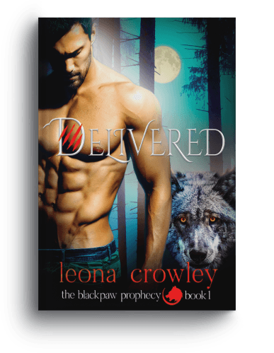
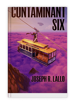
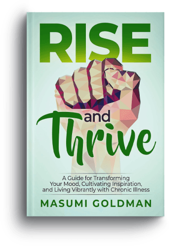
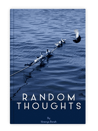
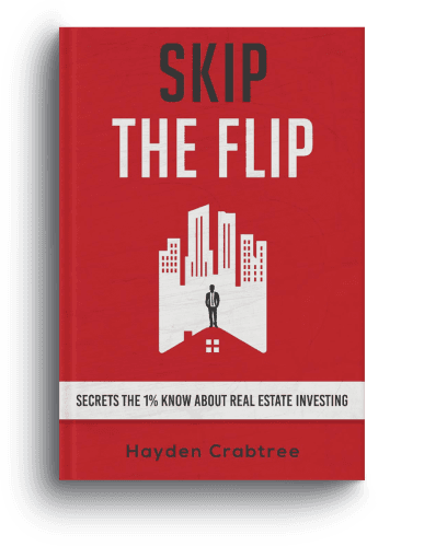
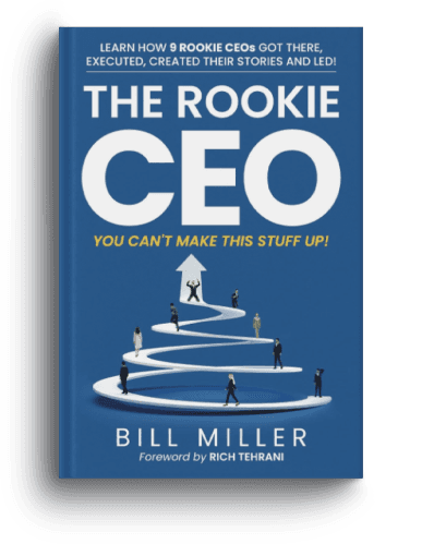
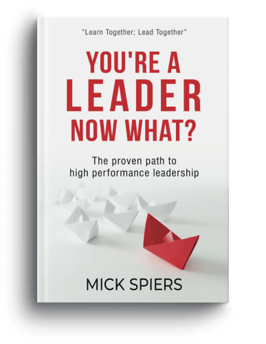
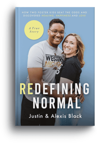
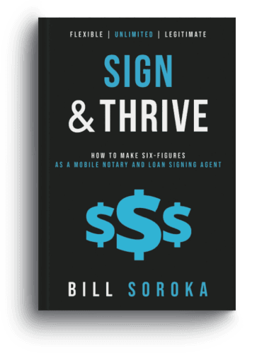
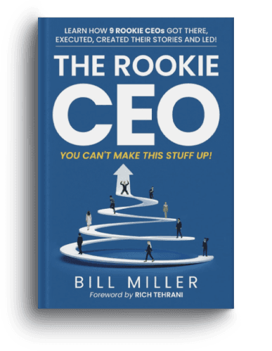
Our Work
Behold Our Portfolio of Masterpieces
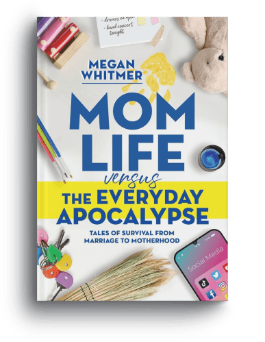
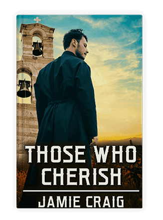
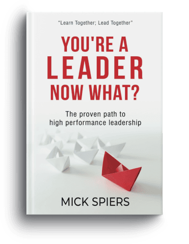
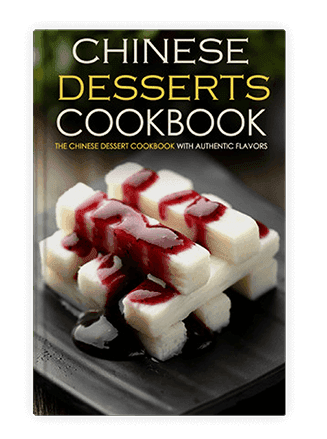
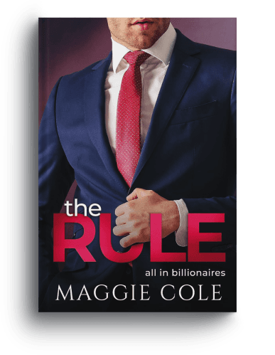
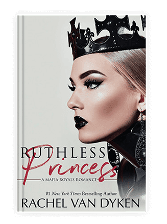
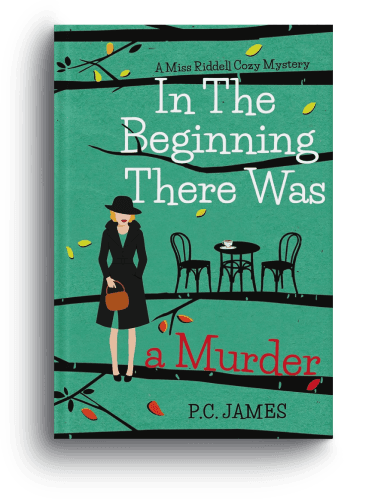
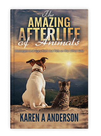
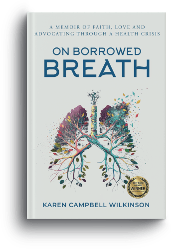
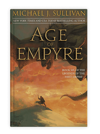
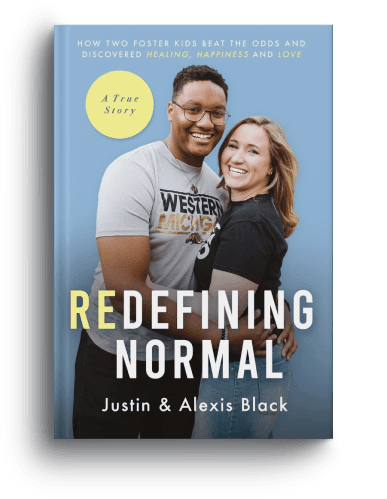
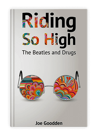
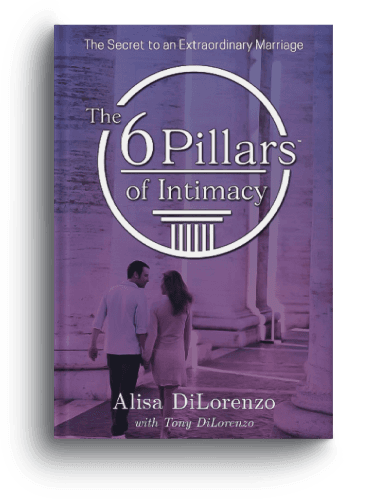
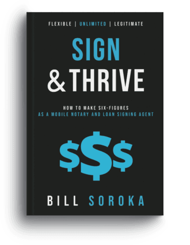
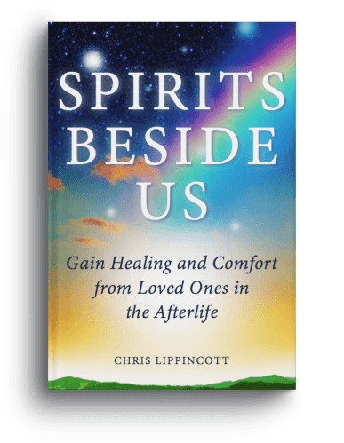
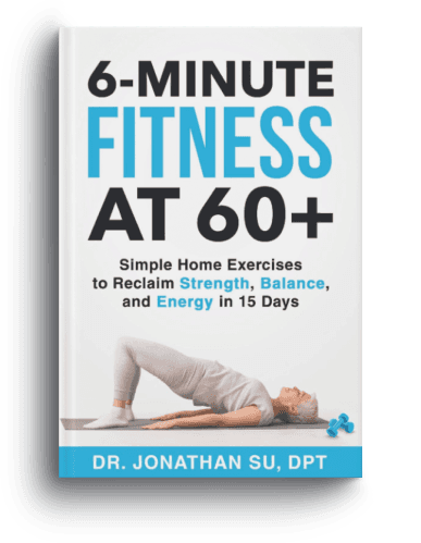
Every book we publish represents our uncompromising commitment to quality. Here are some of our best-selling titles.
Your questions
Illustration Questions.
Honest Answers.
Q: How many illustrations does a children's picture book need?
A standard 32-page picture book has 12–14 active illustration spreads after front matter is allocated. Each spread is typically a full-page illustration or a half-page illustration paired with text. We produce a complete spread map before commissioning begins so you know exactly what's needed.
Q: How much does book illustration cost?
Illustration pricing varies by style, quantity, and complexity. As a guide: spot illustrations from $50–$200 each; full-page illustrations from $100–$300 each; double-page spreads from $150–$500 each. A complete 32-page picture book with 13 spreads typically ranges from $999 to $9,999 depending on style and complexity. We provide an itemized quote after the free consultation.
Q: Who owns the copyright in the illustrations?
You do, fully and permanently. Our illustrator agreements include a complete copyright assignment to you upon final payment. The illustrator retains no rights to reproduce, sell, or display the illustrations. All source files are also delivered to you as part of the project handoff.
Q: How long does a full picture book illustration project take?
For a standard 32-page picture book: consultation and brief, 1–2 weeks; sketch stage, 2–3 weeks; color rendering, 4–6 weeks; revisions and delivery, 1–2 weeks. Total: approximately 8–13 weeks from brief sign-off to final files. Rush timelines are available for an additional fee, discussed during consultation.
Q: Can I see illustrator portfolios before choosing?
Yes, you always see portfolio samples from 2–3 style-matched illustrators before any commitment. We don't assign an illustrator without your approval of their style and genre fit. If none of the initial options feel right, we continue searching until we find the right match for your project.
Q: What if the style isn't what I expected at sketch stage?
Style approval at sketch stage is built into the process for exactly this reason. We produce and approve a single style sample illustration before any full brief is commissioned. If the direction isn't right at that point, we adjust before scaling up, not after. Sketch-stage changes are included in your revision allocation.
Get started
Your Story Deserves
to Be Seen as Well as Read.
Start with a free consultation, we'll review your manuscript, recommend the right style, and produce three style direction samples before you commit to anything. No obligation, no pressure.
Free style consultation · Three sample directions · No commitment required
Begin your project
Tell Us About
Your Book's World
Share what you're working on, the genre, age group, and any visual ideas you already have. We'll come back within one business day with illustrator style samples, an initial scope estimate, and a proposed timeline.
Call us
+1 (929) 684 2021
Email us
hello@bookeunoia.com
Free style samples
3 directions, no commitment