BookEunoia
Book Formatting Services
The Interior Your
Manuscript Deserves,
On Every Device, Every Page.
Great formatting is invisible. Readers don't notice it. What they notice is its absence: the cramped margins, the orphaned lines, the chapter that starts halfway down a page, the eBook that breaks apart on their Kindle. Professional formatting removes every friction between your reader and your words, on the printed page and on every screen.
2
Print & eBookFormats
KDP
& IngramSparkReady
100%
PlatformCompliant
No royalty splits, ever
No hidden fees
Global Distribution
Free consultation, no commitment
What formatting actually controls
Unformatted manuscript problems
Widows & orphans: single lines stranded at page breaks
Inconsistent chapter heading style and spacing
Wrong margins: text too close to spine, unreadable
Missing running headers, wrong page numbering
After professional formatting
No widows or orphans, clean line endings throughout
Consistent chapter openings, headers, and spacing
Correct margins for trim size and binding type
Running headers, folios, and front matter all correct
📖 Print Interior Typesetting📱 ePub & MOBI eBook Files✅ KDP & IngramSpark Compliant🔄 Revision Rounds Included🖨️ Print-Tested Before Delivery
📖 Print Interior Typesetting📱 ePub & MOBI eBook Files✅ KDP & IngramSpark Compliant🔄 Revision Rounds Included🖨️ Print-Tested Before Delivery
Two entirely different crafts
Print Formatting and eBook Formatting
Are Not the Same Thing
The single most important thing to understand about book formatting is that print and eBook require completely different skills, different tools, and deliver completely different outputs. Conflating them results in poor performance on both platforms.
Print Interior Formatting
Fixed layout · Pixel-perfect pages
Print formatting is typesetting, the ancient craft of arranging text on a fixed-dimension page. Every element is placed precisely: margins, gutters, running headers, chapter openings, drop caps, widows and orphans, page numbering, and the treatment of every scene break and section header. The formatter controls the exact position of every element on every page. What you design is exactly what prints.
What print formatting controls
- Trim size, margins, and gutter width for binding type
- Typeface selection and size, readability at the chosen point size
- Line spacing, paragraph spacing, and indentation
- Chapter opening page design and drop cap treatment
- Running headers/footers and page numbering style
- Widows and orphans eliminated throughout
- Scene break ornaments and section dividers
- Front matter sequence: title page, copyright, dedication, TOC
eBook Formatting
Reflowable layout · Reader-adaptive
eBook formatting creates a reflowable file, meaning the text adapts to whatever screen size and font size the reader chooses. You cannot control line breaks or page breaks. What you can control is the semantic structure: heading hierarchy, paragraph styles, image placement logic, and navigation. A well-formatted eBook degrades gracefully on every device from a Kindle Paperwhite to an iPad to a phone. A poorly formatted one breaks spectacularly on at least one of them.
What eBook formatting controls
- Semantic HTML and CSS structure underlying the ePub file
- Heading hierarchy, what renders as chapter titles vs section headers
- Clickable Table of Contents (NCX and nav document)
- Image placement, responsive sizing across screen dimensions
- Font embedding and fallback stack for device compatibility
- Chapter breaks, correct page break logic in the file
- Metadata: title, author, language, ISBN embedded in the file
- Platform-specific validation: KDP, Apple Books, Kobo, Smashwords
Why you need both, and why they can't be converted from each other
A print PDF cannot be converted into a usable eBook file by simply running it through a converter; the result is a broken, unreadable ePub. Equally, an ePub file cannot substitute for a print-ready PDF. Both must be built from the source manuscript using their own separate processes and tools. We produce both from your manuscript simultaneously, so neither is an afterthought.
What good typography does
The Details That Separate
Professional from Self-Published
Experienced readers and trade buyers can identify an unformatted or poorly formatted book interior within seconds. These are the specific elements they're seeing, and we get it right every time.
Widows & Orphans
A widow is a single line of a paragraph stranded at the top of a page. An orphan is a single line stranded at the bottom. Both break the reading flow and signal unprofessional formatting. Every professional typesetter eliminates them; they require manual adjustment of tracking, spacing, and page breaks throughout the manuscript.
One of the clearest signals of amateur formatting to any trade professional
Margins & Gutters
Interior margins (the gutter toward the spine) must be wider than the exterior margins to compensate for the binding's space requirements. Too narrow, and the text disappears into the spine. Too wide, and the book looks amateurish. Gutter width is calculated from page count and binding type, not guessed.
Calculated precisely per trim size, page count, and binding type
Recto Chapter Starts
Chapters in traditionally published books always begin on a recto (right-hand, odd-numbered) page. When a chapter ends on a recto page, the following verso (left-hand) page is left intentionally blank. This is a deep-seated convention that readers feel, even if they can't name it. Violating it signals a book that wasn't properly typeset.
Standard in traditionally published books, applied to every chapter opening
Typeface Selection
The body typeface must be a text-optimized face designed for long reading, not a display font or a common system font. The right typeface at the right size and leading creates a reading experience so natural that the reader never thinks about it. The wrong choice creates micro-fatigue over hundreds of pages.
Genre-appropriate typeface recommendations included with every project
Running Headers
Running headers (the text that appears at the top of every page, showing the book title and chapter title) must follow a specific convention: the book title on verso pages and the chapter title on recto pages. Page numbers (folios) are consistently placed and styled, suppressed on chapter-opening and blank pages per typesetting convention.
Suppressed on chapter openings and blanks, styled to match the overall design
Drop Caps & Chapter Openers
The first paragraph of every chapter is formatted differently: no indent, optional drop cap, and possible space before the first line of body text. These small distinctions signal to the reader that a new section is beginning and lend the book a sense of completion. Inconsistent or absent chapter opener treatment is immediately noticeable.
Chapter opener style established in a style guide and applied consistently throughout
Why these details matter beyond aesthetics
Library acquisition editors, book reviewers, and bookshop buyers evaluate self-published titles before deciding whether to stock or review them. An interior that shows professional typesetting signals that the book was produced with the same care as its traditionally published competitors, and is evaluated accordingly. Formatting is not decoration; it is a credibility signal to every professional in the supply chain.
Before formatting begins
Trim Size: The Decision That
Must Come First
Common trim sizes at relative scale
5″×8″
Literary
Fiction
5.5″×8.5″
Most
Popular
6″×9″
Trade
Non-Fiction
7.5″×9.25″
Picture
Book / Art
| Trim Size | Genre | Page Count Impact | Status |
|---|---|---|---|
| 5″×8″ | Literary fiction, poetry | Higher page count | Standard |
| 5.5″×8.5″ | Fiction, memoir, self-help | Balanced | Most popular |
| 6″×9″ | Business, non-fiction | Lower page count | Trade standard |
| 8.5″×11″ | Workbooks, textbooks | Lowest page count | Specialist |
| 7.5″×9.25″ | Picture books, art | Format-specific | Picture book |
Why is trim size the first decision, not an afterthought
Trim size is the physical dimensions of your finished book, and every formatting decision downstream flows from it. Margins, typeface size, line length, and the number of words per page are all determined by your trim size. Change the trim size after formatting is complete, and you must reformat from scratch.
Trim size also affects your book's production cost per unit. A 5×8 book with a 60,000-word manuscript will have significantly more pages than the same manuscript formatted to 6×9, which increases the print cost per copy and may affect your retail pricing and margins.
Standard trade paperback conventions have emerged for good reasons: 5.5×8.5 is the sweet spot for most fiction, wide enough to read comfortably, small enough to be carried easily, and the size readers' hands are conditioned to expect in a paperback. We advise on trim size as part of the initial brief before formatting begins.
The handoff that determines everything
The Word Document You Send
Determines How Fast We Can Work
A manuscript built on local overrides and manual formatting in Word takes three to five times longer to format professionally than one built with proper paragraph styles. Here is exactly what to look for.
⚠ Slower & more expensive
What makes a manuscript harder to format
- Spacing created by pressing Enter multiple times instead of using paragraph spacing settings
- Indents created with the Tab key or spacebar rather than paragraph indent settings
- Local font overrides applied directly to text rather than through styles
- Mixed heading styles, some manually bolded/enlarged, some using Heading styles
- Section breaks and page breaks applied manually and inconsistently
- Track Changes left active with unaccepted edits still in the document
- Comments left in the document from editors or collaborators
- Images embedded at different DPI levels and scales throughout
✓ Faster & cleaner
What makes a manuscript easier to format
- Consistent paragraph styles used throughout: Body Text, Heading 1, Heading 2
- Chapter titles formatted with Heading 1 style, scene breaks marked with a consistent symbol (e.g. ***)
- Paragraph style, not blank lines, manages single-line spaces between paragraphs
- All Track Changes accepted, all comments resolved before handoff
- Images provided as separate high-resolution files, not embedded in Word
- Footnotes or endnotes inserted using Word's footnote function, not manual numbering
- No manual hyphenation, let the formatter's software handle hyphenation
If your manuscript doesn't match the "clean" description above, don't worry, we provide a pre-formatting manuscript cleanup as part of every project. We'll identify the specific issues, clean the styles, and prepare the file before typesetting begins. This is included in the quote, not charged as an extra.
The pages before chapter one
Front Matter Architecture:
The Sequence Professionals Expect
Standard book front matter sequence
i
Half-title page
Requiredii
Series / other books page
Optionaliii
Full title page
Requirediv
Copyright page
Requiredv
Dedication
Optionalvi
Epigraph
Optionalvii
Table of Contents
Non-fiction: Requiredviii
Preface / Foreword / Introduction
Optional1
Chapter One begins (recto page)
Always rectoWhy front matter sequence matters to trade buyers and libraries
The front matter of a book is where library catalogers, trade buyers, and reviewers look first. A correctly structured copyright page, with the year of publication, publisher name, ISBN, Library of Congress number (where applicable), and the "All rights reserved" notice, signals that the book was produced with professional standards.
A missing or incorrect copyright page is one of the reasons library systems reject self-published books. A half-title page missing, a dedication where the copyright page should be, or Chapter One starting on an even-numbered page, any of these immediately identifies the book as having been formatted without professional guidance.
- Full copyright page with year, publisher, ISBN, and rights notice drafted by us
- Library of Congress Cataloging-in-Publication data block (LCCN) included for qualifying titles
- Title page designed to match the overall interior typography
- Dedication and epigraph placed and spaced with editorial precision
- Table of Contents generated and styled for both print and eBook
- Chapter One always beginning on a recto (right-hand) page
Specialist formatting
When Your Book Needs More
Than Standard Text Formatting
Some manuscripts require specialist interior design skills beyond standard novel or non-fiction formatting. We handle all of these, with specialist designers assigned to projects that need them.
Tables & Data-Heavy Non-Fiction
Tables, charts, comparison grids, and data layouts require careful formatting for both print (fixed) and eBook (reflowable). Tables in ePub files require specific HTML table structures to work correctly on small screens. We format each table to render correctly in both contexts without loss of information.
Print + eBook are both handled with separate table formatting logic.
Code Blocks & Technical Books
Programming books, technical manuals, and educational titles with code samples require a monospaced typeface, line numbering, syntax highlighting, and special treatment for inline code vs. block code, in both print and eBook formats. We have specialist formatters with technical publishing experience.
Monospaced type, code blocks, and line break logic handled precisely
Poetry & Drama
Poetry requires precise control over line breaks, stanza spacing, and the treatment of long lines that exceed the type measure. Drama needs character name formatting, stage direction styling, and act/scene header treatment. These are among the most technically demanding interior formats, particularly in eBooks, where reflowable text clashes with line-break control.
Fixed-width ePub option used for poetry to preserve line integrity
Illustrated & Image-Heavy Books
Books with photographs, diagrams, artwork, or illustrations throughout require image placement logic, caption styling, figure numbering, and image resolution management for both print (300 DPI CMYK) and eBook (72–150 DPI RGB). Each image position is evaluated for orphan risk and layout impact before the page is finalized.
Image resolution, caption style, and placement are all managed per platform.
Footnotes & Academic References
Academic non-fiction, biography, and history books with footnotes or endnotes require specific formatting for both print (footnote overflow management across pages) and eBook (pop-up footnote links in ePub). Citation styles (Chicago, APA, MLA) applied consistently throughout, with bibliography formatted per the chosen style guide.
Footnote overflow across print pages managed; ePub pop-up footnotes linked.
Cookbooks & Recipe Books
Cookbook interior design is a specialist discipline; ingredient lists, method steps, cooking times, serving sizes, and photography placement all require specific layout conventions. Cookbooks are typically in landscape or square format, with a layout grid that integrates full-bleed photography and a readable recipe structure.
Specialist cookbook layout, ingredients, method, and photography integration
What you receive
Every File You Need,
for Every Platform.
A complete file package, print-ready and eBook-ready, built to the specifications of every major publishing platform so you can upload and publish immediately.
KDP Print-Ready PDF
Interior pages formatted to Amazon KDP specifications: correct trim size, bleed settings, 300 DPI images, and embedded fonts. Passes KDP's interior preflight check on first upload.
PDF/X-1a · 300 DPI · Embedded fonts · Correct bleed
IngramSpark Print-Ready PDF
Separate IngramSpark-optimized interior PDF. Ingram has slightly different file specifications than KDP. Both files are provided rather than one generic print file that may fail either platform's preflight.
IngramSpark spec-compliant · Separate from KDP file
ePub 3.0 File
The universal eBook format, accepted by Apple Books, Kobo, Google Play, Barnes & Noble, Smashwords, and all aggregators. ePub 3.0 validated and accessible-compliant. Includes a clickable Table of Contents, chapter navigation, and correct metadata.
ePub 3.0 · Validated · Accessible · Clickable TOC
MOBI / KFX File (Kindle)
Kindle-specific format for Amazon KDP eBook upload. While KDP now accepts ePub directly, a Kindle-optimized file ensures correct rendering on all Kindle devices and apps: Paperwhite, Fire, iOS, Android, and desktop.
Kindle-optimized · All Kindle devices and apps tested
Source Files
The InDesign or equivalent source file from which your print interior was built, so future edition corrections, second editions, or translations can be made without reformatting from scratch. Delivered alongside the final PDF.
INDD source file · Future-proof for revisions
Preflight Report
A written summary confirming that all delivered files have passed platform-specific preflight checks: resolution, fonts, color space, bleed, and ePub validation. Any platform-specific considerations are documented so you can upload with confidence.
KDP · IngramSpark · ePub validator confirmation
All files are tested against their platform's preflight tools before delivery. We do not deliver files that will fail on upload; we resolve any preflight issues before handoff.
How a project runs
From Manuscript to
Platform-Ready Files
A clear, staged process, you review and approve the interior design before the full manuscript is formatted, so nothing is applied at scale without your sign-off.
1
Brief & Scope
Trim size, genre, format requirements (print, eBook, or both), and any design preferences confirmed.
Day 1
2
Manuscript Cleanup
Paragraph styles normalized, track changes accepted, structural issues identified and resolved before typesetting begins.
Days 2–3
3
Interior Design Sample
The first three chapters have been formatted and sent for your approval; typeface, margins, chapter openers, and running headers are all established and agreed upon before the full manuscript is set.
Days 4–6
4
Full Formatting
Complete manuscript formatted per approved design. Widows and orphans resolved. Front matter structured. All elements are applied consistently throughout.
Days 7–14
5
File Delivery
All files preflighted, tested, and delivered; print PDFs, ePub, MOBI, and source files, with a preflight report confirming platform compliance.
Delivery
Revisions after the sample is approved
The interior design sample stage is specifically designed to surface all design preferences before the full manuscript is formatted, making revisions at that point fast and inexpensive. After full formatting, two rounds of text corrections are included (fixing typos or minor content changes identified during review). Structural reformatting after full completion is outside the standard scope and quoted separately.
Author experiences
When the Interior Made
the Difference
★★★★★
"I'd tried to format my own novel in Word. It looked fine on screen. When I ordered a proof copy, the inner margins were so narrow that text disappeared into the binding on every page. BookEunoia reformatted it correctly, and my first proof copy from the new files was exactly as it should have been. I wish I'd done it professionally from the start."
★★★★★
"My business book had a lot of tables and diagrams that I'd built in Word. Every eBook converter I tried mangled them beyond recognition. The BookEunoia team rebuilt the tables in ePub-native format so they render perfectly on every device. They also pointed out that my original Word diagrams were at 72 DPI, which would have printed badly, and asked me to provide the originals at proper resolution."
★★★★★
"I didn't know that my front matter was wrong until a librarian told me they wouldn't catalog my book because the copyright page was missing the required information. BookEunoia rebuilt the entire front matter, applied for an LCCN, and delivered an updated file within four days. Every book I've published since has had the front matter built correctly from the start."
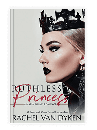
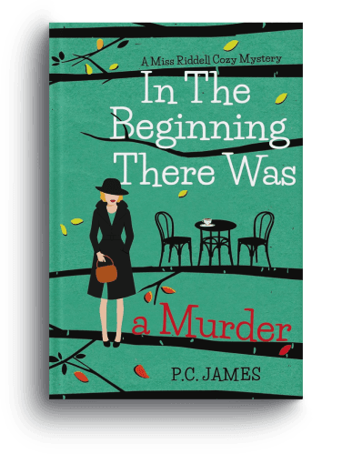
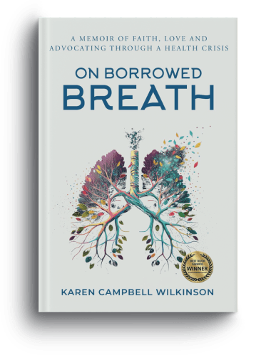
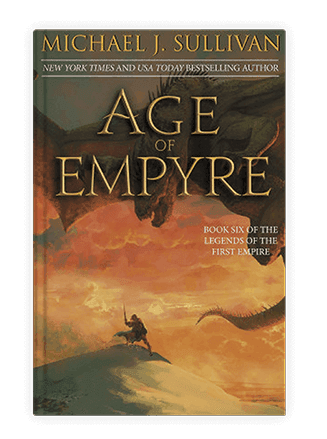
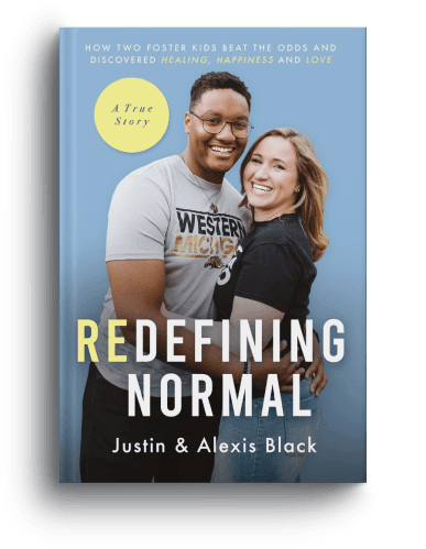
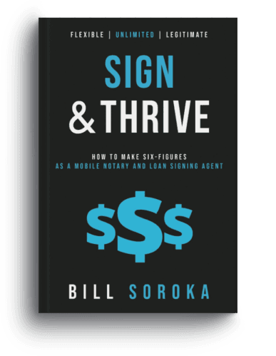
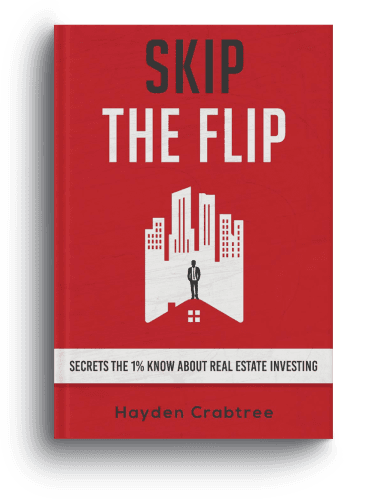
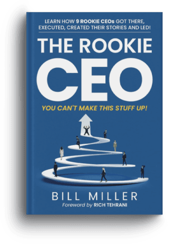
Our Work
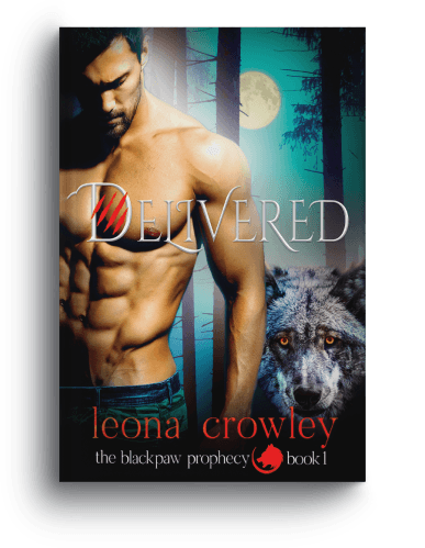
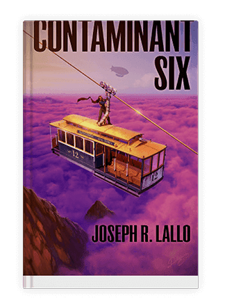
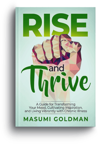
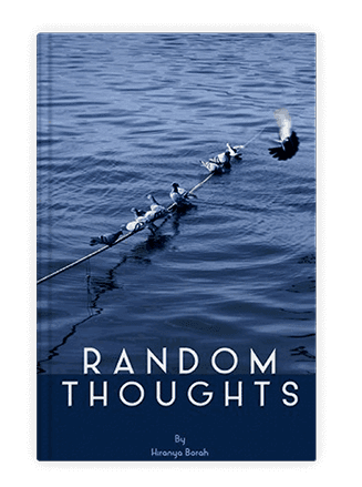
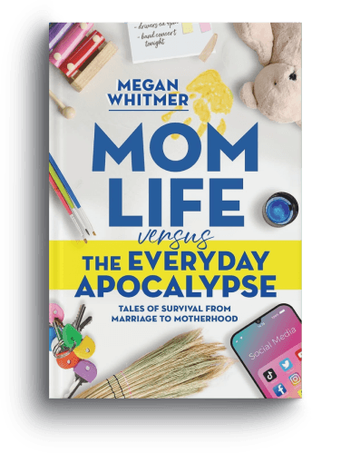
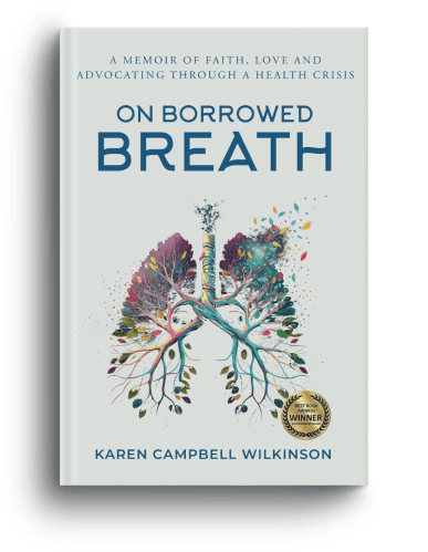
Behold Our Portfolio of Masterpieces
Every book we publish represents our uncompromising commitment to quality. Here are some of our best-selling titles.
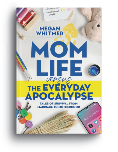

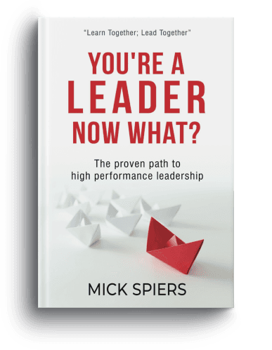
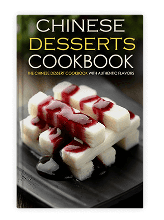
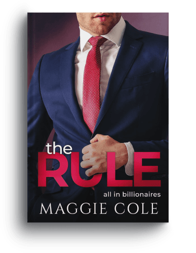







Your questions
Formatting Questions.
Direct Answers.
Q: What is the difference between formatting for print and for an eBook?
Print formatting is fixed-layout typesetting, every element is placed precisely on a fixed-dimension page, and what you design is exactly what prints. eBook formatting creates a reflowable file in which the text adapts to the reader's chosen screen and font sizes. Both require different tools and skills, and a print PDF cannot be converted into a usable eBook file; they must be built separately from your manuscript.
Q: How long does book formatting take?
For a standard novel (60,000–90,000 words, text only): 7–12 business days from brief sign-off to final file delivery. Non-fiction with tables, images, or complex layouts typically takes 12–18 business days. Rush turnarounds are available. We always provide a specific delivery date before work begins, not an estimate.
Q: Do I need to format for both print and eBook?
If you're publishing in both formats, which we recommend for maximum distribution, yes, both must be formatted separately. We produce both simultaneously from your manuscript as part of a single project, which is more efficient than commissioning them separately. If you only need one format, we quote for that alone.
Q: What if I make text corrections after the book is formatted?
Two rounds of text corrections are included after full formatting is complete. This covers typos identified during your review of the formatted proof. Significant content additions or structural changes after formatting are outside the standard scope; they require a re-quote based on the extent of the changes. This is why we recommend completing proofreading before formatting begins.
Q: Can you format a book that has already been partially formatted?
Yes, though it is often faster to start from a clean manuscript than to correct an existing formatted file, depending on how it was built. If you have a Vellum, Reedsy, or Word-formatted file, we'll assess it and tell you honestly whether it's faster to correct it or reformat from the source. There's no extra charge for this assessment.
Q: How much does book formatting cost?
Formatting is priced by word count and complexity. As a guide: standard novel formatting (print only) from $250–$500; print + eBook from $400–$750; complex non-fiction or illustrated titles from $600–$1,500+. We provide a transparent, itemized quote after reviewing your manuscript. The quote is firm, not subject to scope creep.
Your Manuscript Deserves an Interior
as Carefully Crafted as its Words.
Get a transparent formatting quote. We'll review your manuscript, confirm your trim size and format requirements, and come back within one business day with a firm price and a specific delivery date.
Firm quote · Specific delivery date · Print-tested before delivery
Start your project
Tell Us About
Your Manuscript
Share your word count, format requirements, and any special layout needs, and we'll come back within one business day with a firm quote and a specific delivery date, no vague estimates.
Call us
+1 (929) 684 2021
Email us
hello@bookeunoia.com
Response time
Within 1 business day